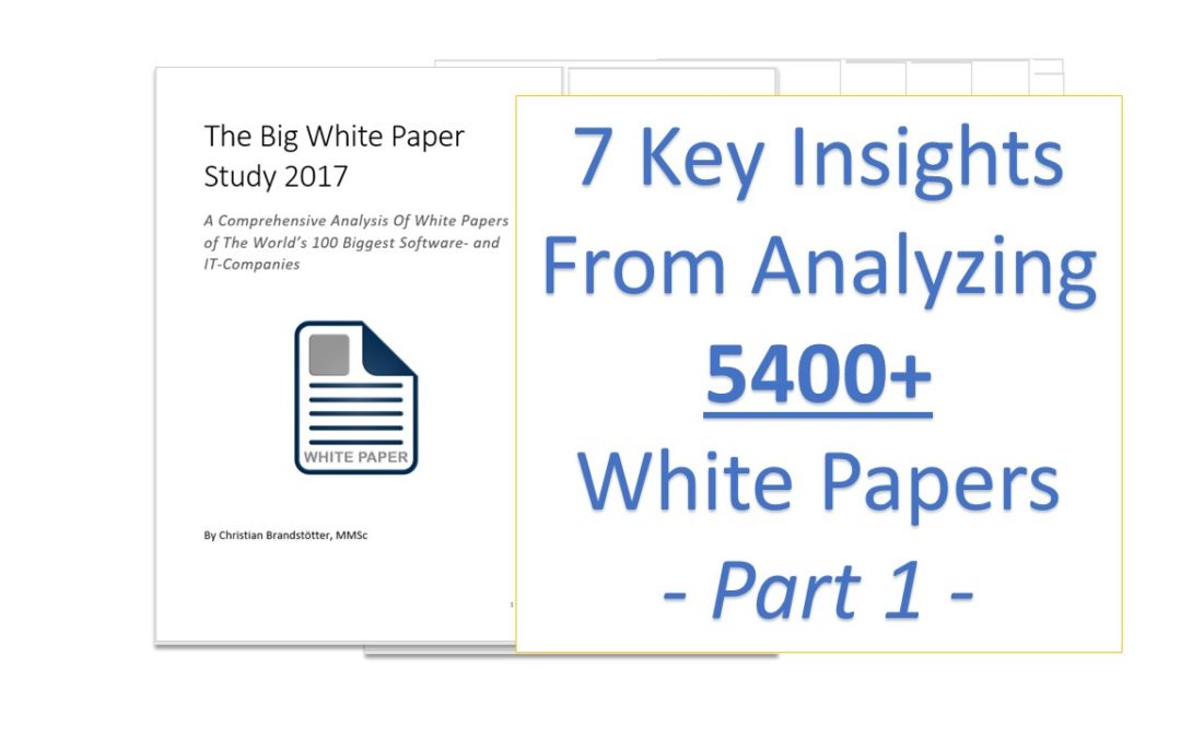
What is a white paper? Are there certain standards or best practices in the production and marketing of white papers? What structure should a white paper ideally have? With an analysis of 5400 white papers from the largest software and IT companies, I wanted to find answers to these questions.
1) The definition of a “white paper” varies greatly.
The first thing that I learnt is that there is no uniform definition of what a white paper is. Analyzing 3000, 4000 white papers it became very obvious that companies have their own, unique ideas about what a white paper is.
For readers this means that are online, searching for white papers and downloading them, they may be confronted with a document that has 5 pages and is quite salesy, they may be confronted with a 40-page, technical white paper that does not include any graphics and reads itself like a master thesis…
Of course, there are different types of white papers, according to famous author Michael Stelzner for example, there are technical and thought leadership white papers. Still, the shown lack of uniform standards in white papers can leave readers frustrated. “Okay, I will read a white paper on it. But will that take me 10 minutes or an entire hour?”
Another field in which white papers vary greatly is the usage of images and illustrations. Furthermore, also there is a broad spectrum from very salesy, pitching white papers to very technical, scientific-style white papers. But more on this in a lesson further down below.
2) Many companies make their white papers extremely hard to find.
Another observation I have made searching for and downloading the companies’ white papers is that they can be extremely hard to find. The majority of companies make it quite easy to find white papers on their website, but in some cases I was browsing around for a few minutes before I discovered them by accident.
This shouldn’t be the case. For anyone interested, they should be able to find the white papers with a few clicks. Sure, a corporate website has to host all kinds of information, but a white paper is an important part of that – especially if a company wants to present itself as a thought leader and pioneer in their industry and marketplace.
“But most people search for white papers via Google.” you may object – and rightly so. Still, for all the viewers who don’t land directly on the white papers landing page (if there is one, which is often not the case), you should make it easy and quick to find the information they are looking for.
What best practice do the good companies use? It is typically an adaptation of this general rule. The first click is on the horizontal navigation bar where it says something like “Insights” or “Resources”. A second click then goes onto “white papers” or “document library” where a user can choose the document type “white paper” from a dropdown list.
Another handy alternative is of course a site-internal search engine where the users can simply type in white paper and be prompted to relevant search results.
3) There are 2 commonly used layouts in white papers.
Initially, I didn’t set out to analyze the layout of white papers. This is something I noticed once I was into the analysis: the type of layout has a big impact on the reading experience of the document. So I started anew, this type also noting down what page layout the companies were using for their white papers.
What I found was that there are basically two types of page layouts. There are what I call the “1+1” and the “2 + 1” page layouts, the first one of which is by far the most common one.
The 1+1 layout means that there is typically one broad column, taking up about 75-85% of the entire breadth of the page, in which the main text goes, whereas a second, thin column taking up about 25-15% of the page width is reserved for annotations, citations, key metrics or important statements to be highlighted. The order of the columns occurred both ways – the thinner one could be on the left or the right side.
The 2+1 layout means that there are typically two columns of main text, each column taking up about 35-40% of the page width with a thin column on either the left or the right side, taking up about 15-25% of the page width and containing annotations, citations, key metrics or important statements.
From my own reading experience, I clearly prefer the first one, because it is more eye-friendly and easier to follow the content. It also relates in style to classical academic journals and scientific papers, which is probably something you would rather like to have your white paper related to – as it builds more authority and credibility. It also makes annotations much easier – whether you already put them there or the reader makes them him- or herself.
The downsides of the 2+1 layout are for one that it is hard to make annotations or describe what a specific text passage is about because it is unclear if you are referring to the first or second column. Moreover, the resemblance with newspapers and magazines may be less advantageous than resembling scientific articles. I do understand though that some readers may disagree with me on this.
4) There seem to be 2 different philosophies on image usage.
White papers aren’t all about text, they are first and foremost about information. Valuable, timely and relevant information for your readers. And images and illustrations can be a big part of that – but don’t have to be.
Therefore, I looked into whether, how and how often companies use images and illustrations in their white papers. What I found was that there seem to be two dominant, widely different philosophies when it comes to using images and illustrations.
One attitude seems to be “the more, the merrier”, almost as if images were the main content of the white paper. The other attitude seems to be “text only, images if otherwise impossible”. Both are tricky, because the first attitude often resulted in salesy marketing and image brochures that were “images with a text”. The latter brought about papers that looked as if they had been taken straight from scientific journals. Authoritative yes, but readable – no.
My take on images and illustrations in white papers is that they should always be there if they are helpful and supportive in getting your message across. Otherwise not. As I already talk about in my article on ICO White Papers, I would highly encourage you to always ask yourself these two questions BEFORE you put any image or illustration into your white paper:
- Can an image or illustration help us to get this message across more effectively? If NO, leave it out. If YES, ask yourself question 2:
- What type of image or illustration would help us best to get this message across more effectively?
Simple, logical questions. No rocket-science, but who really uses it?
If you would like to gain access to the full report on the extensive analysis, including benchmarks and key metrics on all quantitative aspects of white papers, as well as a qualitative analysis in terms of contents and readability as well as a blueprint for the OPTIMAL WHITE PAPER STRUCTURE, be sure to claim your download now.
If you would like an experienced white paper author to support you in the creation and effective marketing of your next white paper, contact me now to discuss the next steps.